When North York Arts started planning the Northbound exhibitions for 2021, we knew that working on improving access within our programs was one of our organization’s priorities. For Northbound we decided to focus on the important aspect of image descriptions for the artworks exhibited online. This was something very new to us and we couldn’t have done it without the talented team at The Disabled List, who created the image descriptions and walked us and our artists through the process. The text below was created by The Disabled List and talks about the concepts related and the learnings behind this process. You’ll be taken through each exhibition through the lens of accessibility, allowing you to experience them from a new perspective.
What are image descriptions and alt-text?
Alt-text and image descriptions are tools for making visual content available to people for whom it would otherwise be inaccessible. This can include people who are blind or have low vision, and it can also include a wide range of people who deal with light sensitivity or visual distortion, or who have difficulties perceiving or processing visual information.
An image description is exactly what it sounds like: a description of an image so that someone who cannot see or understand it will be able to have a similar experience to someone who can. Alt-text is a way of providing image descriptions for digital content – it refers to a specific element of any image object on a web page, which can be filled in with a description that can then be read aloud by screen reader devices.
What should an image description do?
There are many different ways of writing image descriptions, that depend on how we answer the deceptively simple questions: “what constitutes a ‘similar experience’ to viewing an image?” and “what does it take to create that experience?” Our answers will likely change depending on context; the way that someone experiences a product image on a retail website is different from how they experience a reaction GIF on Twitter, which is different from how they experience a journalistic photograph, which is different from how they experience a work of art in an exhibition. So in trying to answer these questions, we also have to ask ourselves, “what does this particular image do in this particular context?” Knowing what an image does helps us to decide what parts of it we need to emphasize in order to translate the experience of viewing it into text.
Determining what an image does is simpler in some cases than others. A product image on a retail website makes the product more tangible and appealing to a potential buyer, as well as possibly conveying information that hasn’t been included in the product description, such as the shape of the knobs on a set of drawers, or the ornamentation on a picture frame.
A reaction GIF on Twitter expresses a feeling that the person posting it is experiencing. It can also create a sense of kinship or community, not just through shared recognition of the feeling portrayed by the image, but also potentially through shared affinity for the aesthetics of the image and its original source, such as might occur when fans of Rupaul’s Drag Race or Schitt’s Creek share and encounter the many reaction GIFs spawned by those shows.
A journalistic photograph at the top of a news story can make the textual content of the story more tangible, much like a product photograph. But through its formal composition it also conveys a particular aesthetic sensibility and emotional tone. In doing so, it provides journalists and editors with a way of subtly circumventing their industry’s rigorous code of objectivity. Thus, it functions as a kind of dark pattern design. That is, it is a design element that influences how a user perceives, interacts with and responds to a product, system or interface, without the user being aware of how they are being influenced.
What does a work of visual art do?
Determining what a work of visual art does is not simple. There are certain things that many artworks tend to do; they may evoke feelings and memories, they may introspection or critical reflection, they may provide an engrossing sensory experience, they may prompt discussion among different viewers. As part of a gallery or exhibition, they may illustrate certain art historical patterns or tell part of a story. But fundamentally, what an artwork does is mediate a kind of internal conversation between the artist and each person who experiences the work, and so what an artwork does is also different for each pairing of artist and audience member.
Writing artistic image descriptions
If image description tries to translate a generalized experience of viewing an image into text, what do you do when it’s not possible to generalize the experience of viewing a particular image? One approach might involve asking many people to describe the image. Together, all of their descriptions could provide a kind of consensus of what it is like to view the image. But practically speaking, it could be difficult to seek out that many descriptions for every image in an exhibition. Image description is also a skill—learning how to critically reflect on what parts of an image you are focusing on, what thoughts or feelings they bring to mind for you, and how to describe those things in a way that is both comprehensive and concise takes practice—which introduces a further practical barrier to the possibility of seeking numerous image descriptions of a single work of art. Most importantly, a screen reader user would be bombarded with all of these separate image descriptions in quick succession, which could easily lead to an experience that is overwhelming rather than satisfying, informative or reflective.
A more straightforward approach to image describing a visual artwork is to translate a single person’s experience of viewing it. A practiced writer of image descriptions can analyze and concisely summarize the key elements of their own viewing experience. However, this kind of description risks becoming an interpretation rather than a translation. Ambiguity is an important part of how we experience many works of visual art. We look, we react and we think. We consider what the artist may have been thinking or feeling as they created the work. We wonder what, if anything, they may have been trying to express or communicate. As we do that, our initial impression of the work may evolve. An image description that is too concrete or too sure of what it has to say erases that ambiguity. Rather than affording an opportunity for dialogue between the perspectives of the audience member and the artist, it presents a monologue from the interpreter.
Through their Alt Text as Poetry project, artists Bojana Coklyat and Shannon Finnegan propose framing image descriptions as a kind of poetry. They provide three reasons for this approach:
- Writing poetically encourages people to choose their words thoughtfully, considering how their connotation and tone relates to the visual content of the image being described.
- Poetry encourages frugal word usage, which can help curb the instinct to “over-describe” an image.
- Poetry invites a sense of playful experimentation, instead of treating image description as a rote chore.
We believe there is a fourth reason why a poetic approach is especially useful for artistic image description. Like visual works of art, poems often deal in ambiguity. They use words and phrases with multiple possible meanings, whose availability shifts depending on the personal and cultural context of both the poet and the reader, as well as the structural context of the poem itself, and perhaps the collected body of work in which it appears. These shifting meanings can evoke sensory and emotional impressions, as well as philosophical, historical and political ideas—and what they evoke will depend on the reader. By using figurative language, a writer of image descriptions can communicate elements and impressions of a visual art work indirectly, rather than explicitly or concretely. In doing so, they can preserve a sense of curiosity, uncertainty and exploration for audience members who read the descriptions.
Describing the Northbound Exhibition Program
In order to describe the images in this year’s Northbound Exhibition Program, we first met with each of the artists to understand how they were hoping for audiences to experience their work. We asked them about their influences, materials and methods, as well as about any themes, motifs and messages within the works they had chosen to exhibit. We were aware that as two white, Anglophone people born in so-called North America, our cultural frames of reference were different from many of the Northbound artists whose work we were trying to translate, so we asked whether there were any culturally-specific details that the artists wanted to make sure audience members were made aware of. Conversely, we also asked if there were things about the works that they wanted to leave open to interpretation.
After these conversations, we spent time looking at and thinking about each of the images, and used the poetic approach described above to develop descriptions that captured both our experiences as viewers and the context the artists had provided us. We divided up the exhibitions and for the most part, each of us described all of the images within the ones we’d chosen, in order to maintain a consistent tone and perspective for each show. However, we also shared many of our descriptions with each other in order to ask for language suggestions, confirm they made sense, and check that they weren’t imposing interpretations that felt inappropriate or overly rigid.
One thing we discovered was that describing an image as part of an exhibition is very different from describing an image in isolation. We quickly realized that the language we were using to describe recurring motifs was repetitive, and so we needed to find ways to vary our language to make the reading experience more interesting and engaging, without losing the sense of continuity created by the presence of the motifs. In some cases, the motifs also had symbolic meaning, which created both an opportunity and a challenge for figuring out how to acknowledge their role without becoming too explicit or redundant.
Some of the exhibitions were also highly structured—organized according to narratives or distinct spaces and subject matters—and we had to find ways to communicate how each image was related to the overall structure, because understanding that relationship was an important part of experiencing the work.
In the sections below, we will discuss the specific approaches we took, challenges we encountered and things we discovered in creating the descriptions for each of the Northbound 2021 exhibitions.
Alone Together: Six Feet of Separation (Liz)
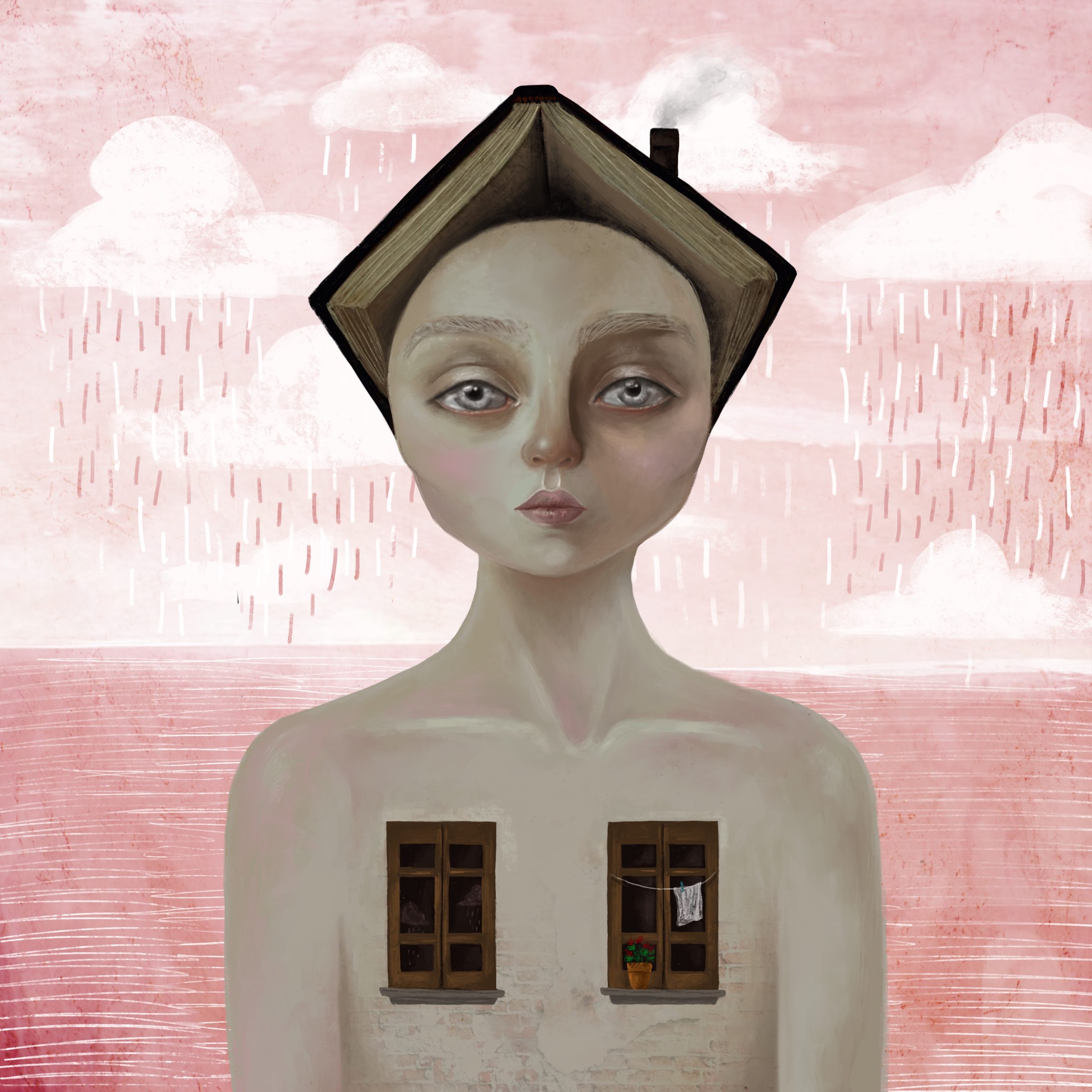
In Alone Together: Six Feet of Separation, Anna Mehr illustrates her personal experiences of the pandemic, starting in the initial days of Ontario’s first lockdown. Alone Together is one of two spatially oriented exhibits in this year’s Northbound program, and this orientation opened up questions about how to describe repetitive elements across a series of images without becoming monotonous.
After spending far too much time with a thesaurus, I concluded that the role of the image description writer is not to merge with an artist, but rather to interpret them. As such, the descriptions did not need to replicate the visual continuity Anna created; they simply needed to reference it.
For instance, the image description for “Melancholy” includes the phrase, “like each of the others, their oversized eyes eclipsed their mouth in size.” This is the only time I reference the size of the character’s eyes across the entire Alone Together series. Using a single image description to establish continuity created space to feature less obvious elements of other images without bulking up the descriptions.
Writing the descriptions for Alone Together was a practice in balance. I worried about over-dramatizing the subtle shifts in emotional affect that Anna’s illustrations conveyed. Fortunately, our conversations with Anna provided me with a starting point to work from.
For “Homemade,” Anna asked us to reference the figure’s expressionless face, while she described the character’s face in “Melancholy” as numb. Both faces have many similar attributes; their lips are pursed, their cheeks are rosy, and yet there is something subtly different about each that is captured by the nuance of Anna’s language.
Alone Together offered an exciting opportunity to use text to illustrate a visual narrative. Anna is telling a durational story, one that extends beyond the parameters of this exhibit, and could continue indefinitely as an ongoing part of her artistic practice. It therefore felt important to create space in the descriptions, not just for interpretation, but also for elaboration.
Meraki Project (Liz)
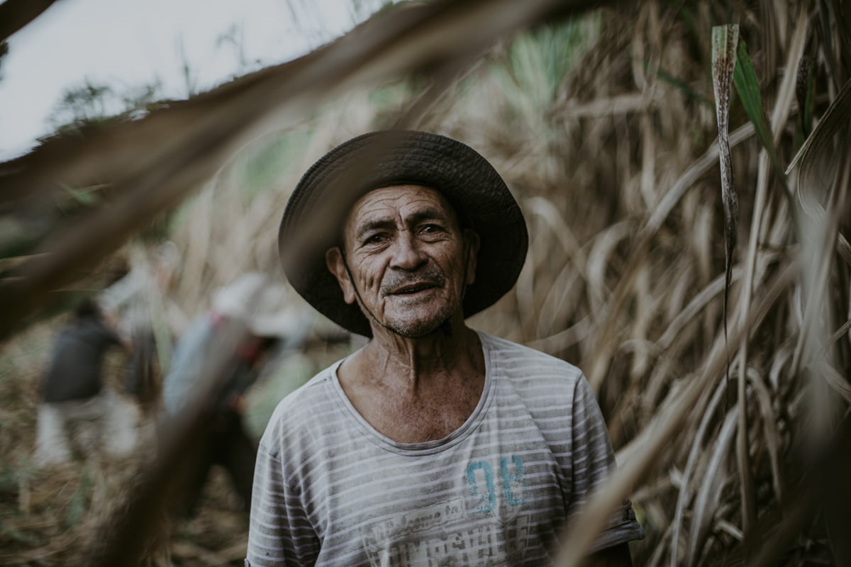
Meraki is distinct from the other Northbound 2021 exhibitions, in that it uses the medium of photography to document the lives and work practices of real people—specifically, of Colombian laborers.
As a white American, I immediately grew concerned about the ethics of what I was participating in. What role does a person who has no knowledge of a country, a people, or a labor practice have in describing such imagery? Given the necessities of image descriptions, often sought on the fly, and with limited context, I decided to engage in this tension to ask how the work of describing an image can play a role in dismantling whiteness.
Paula Marin and Felipe Noriega, the Colombian photographers who comprise the collective Meraki, were very clear that the Colombian laborers they are documenting are not an intended audience for this exhibition. Instead, the project was created to address, “the social stigma that Colombians have, due to drug dealers, and the armed conflict.” These depictions, rife in film and television, exist in conflict with the knowledge Paula and Felipe hold about their country and its people. Their method of advocacy led them to turn first in one direction, toward Colombian laborers, to document them. Through this exhibition, they are now turning in an entirely different direction, toward those of us who have consumed the stereotypes they are addressing.
It was through the process of writing Meraki Project’s image descriptions that I came to believe this is very much an exhibition about consumption, a theme to which I have alluded within the descriptions by explicitly referencing the luxury logos worn by the laborers. This realization caused me to shift the way I had intended to write the descriptions, as I did not want to continue the pernicious cycle of consumption Meraki seems to be critiquing.
My initial, misguided instinct had been to play with sentence structure through enjambment, that is, “the continuation of a sentence without a pause beyond the end of a line, couplet, or stanza.” I had wanted to see how I might be able to affect the reading of image descriptions through line breaks and incomplete syntax.
This instinct quickly began to feel misplaced and contrived, for reasons that have been identified by Black Deaf creators, noting the harm that happens when people operating outside of a culture gain accolades for interpreting that culture. Recently, a video of a white, hearing interpreter signing the song “WAP” went viral on social media, part of a wider trend of similar videos. Speaking to the New York Times, Raven Sutton, a Black ASL performer, explains that this trend is harmful because, “[t]his is a hip-hop song talking about a Black experience of a Black thing, but we got a white face who’s gone viral, so white people are getting the glow up off these types of things.”
Describing an image does not require learning a new language, which considerably broadens the range of people who may do this kind of work. As such, it feels necessary to incorporate a process of reflection into the professional practice of writing image descriptions, so that those who do engage in this labor can be aware of, and accountable for, their own biases and motivations.
Writing image descriptions for Meraki Project raised questions about the need for structure over poetic ambiguity. When an audience has been exposed to harmful stereotypes about a culture that is not their own, it is essential to provide concrete descriptions that can help to dispel harmful interpretations. When writing the exhibition’s prosaic image descriptions, I used the following questions as loose guidelines:
- Classify the photograph: Was it a landscape? A still life? A portrait?
- Determine the subject’s relationship to the photographer: Were they engaged in work? Were they interacting with the camera?
- Conduct a visual analysis: Noteworthy elements may include Line, Shape, Tone, Color, Pattern, Texture, and Form.
- Consider Interpretation: If an interpretation about the laboror’s relationship to their work offered any value, it was included.
Meraki Project features eight series of images, each of which documents the labor done within a particular geographic region. The images in each series occupied the same physical space, which posed a risk of descriptive monotony. To address this, a small adjustment was made to the structure of the website, so that each section now features an image description of the physical space that the audience encounters before gaining access to the rest of the photographs. While the rest of the photographs are described in alt-text, and therefore not visible, the visibility of the spatial image descriptions created an opportunity to make the geographic region of each series known.
Messengers (Alex)
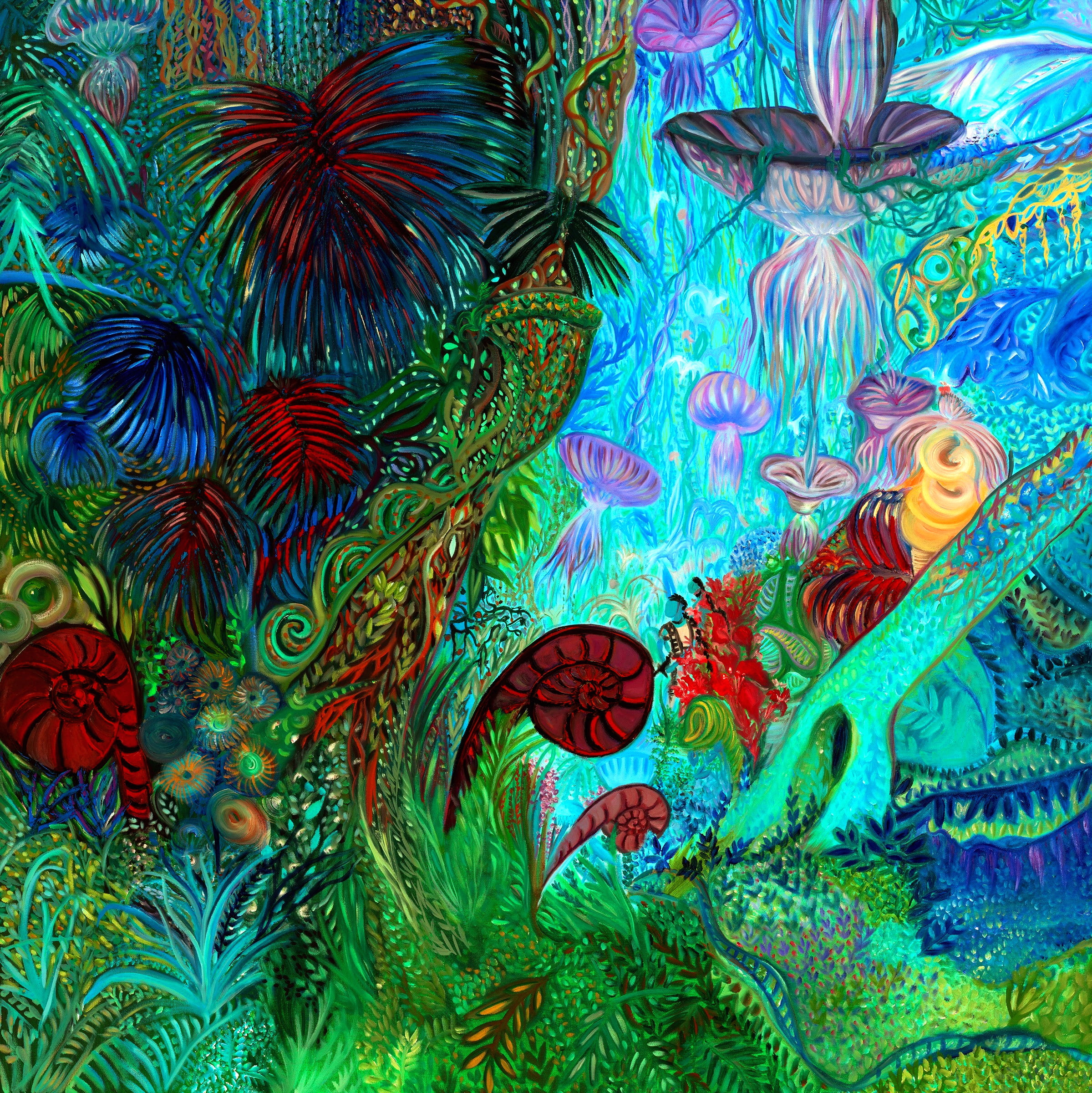
Ashley Beerdat’s exhibition Messengers tells a story that spans three epochs in time: the past, present and future. The story is not concerned with communicating a linear narrative as much as it is with building a world and its mythology, and in using those to explore themes of violence, colonization, hope and resilience. The world of Messengers is a patchwork of (pre-)historical, folkloric, and pop cultural images drawn from our own. Consequently, one of the most interesting challenges in creating its image descriptions was figuring out how to describe highly recognizable figures in a way that acknowledges both their familiarity and their reimagined roles within this new, syncretic world.
In trying to accomplish this, I chose to avoid literal descriptions of the central figures in the images, focusing instead on their textures, movements and moods, as well as any apparent symbolic role they played within their scenes. For example, I described the elephants in “The Epirota Phalanx” as “great beasts, though they are more fragile than their Cretaceous progenitors: instead of leather or stone, their hides are textured like panes of crown glass.” This captures the distinctive, circular patterned texture Ashley used to depict them, and also refers back to the descriptions for two other works in the Past series, in order to create the sense that these images are all part of a continuous history.
As with Meraki’s exhibition, the works in each of Messengers’ three sections share substantial similarities in terms of their colour palette and the landscapes and figures represented within them. Unlike the Meraki project, however, these repeated elements are not part of a static backdrop that could be described separately from the scenes in which they appear. This meant that I needed to be mindful of avoiding redundant vocabulary. In some cases, this meant digging for synonyms; in others, it meant alternating concrete descriptions of shape, colour and texture, with direct analogies to familiar flora and fauna.
Unraveling Dreamscapes (Alex)
Aqsah Shah’s dreamscapes immediately resonated with me. As a narcoleptic, I not only spend a great deal of time lost in sleep, I spend an abnormal proportion of it in rapid eye movement, which is the stage of sleep when we do most of our dreaming. So when we met to discuss her work and Aqsah spoke about how she works with imagery that represents uncertainty and hybridity, merging between dimensions and playing with perceptions of time, I was excited. I was also concerned that my feeling of personal connection to the work might cause me to over-interpret it. Aqsah was clear that she did not want to impose any singular meaning or experience on the audience; she wanted for each person to relate to her pieces in whatever way felt right to them.
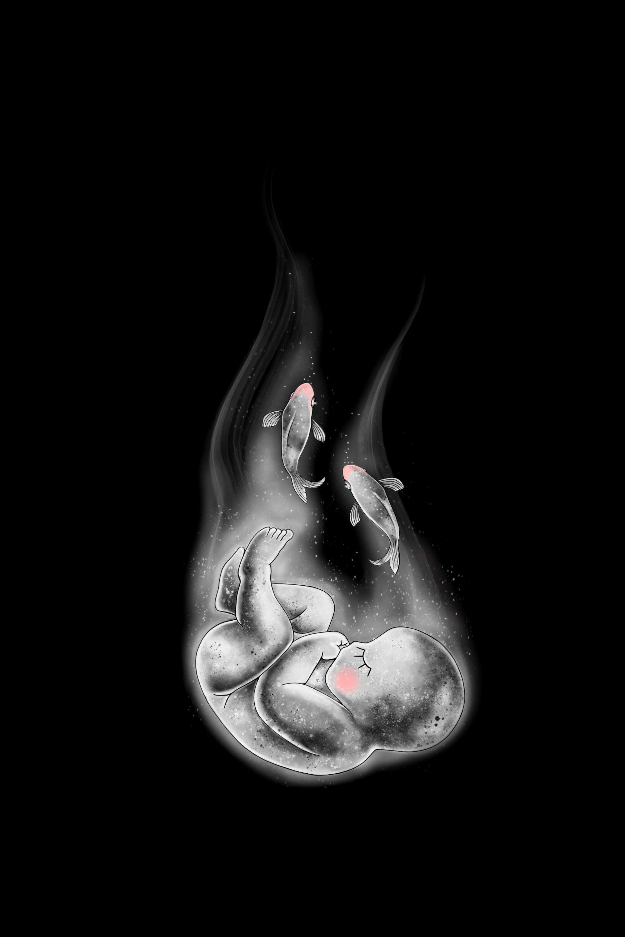
Because of Aqsah’s desire for open-endedness, and because of her surrealist style, I took a poetic approach to describing the works in Unraveling Dreamscapes. Instead of describing elements of an image in literal or concrete terms, I tried to think about the role it seemed to be playing in the image, or even the exhibition, overall. For example, in “The Waiting,” I described the fetal form as a “gestating consciousness” as a way of capturing how it forms a boundary between two worlds in the image—one of them colourful and fully rendered, the other sketchy and monochromatic—as well as of acknowledging the fetus’ role as a motif that repeats across multiple works, seeming to represent themes of uncertainty and in-betweenness.
With some of the works, I also tried to reflect on the overall feeling they conveyed. Some of the images reminded me of a sensory memory, which I tried to translate into general terms that would hold meaning even for someone who doesn’t share it. “Out of Harm’s Way” evoked a memory of looking out my window at four in the morning, the feeling of being embraced by the darkness and quiet, before the rest of the world is awake. Since presumably not everyone feels the same way that I do about early mornings or darkness, I tried to describe the specific features that make it feel so safe to me.
These two approaches, reflecting on the overall impression of each image and considering the roles that specific elements played within them, helped me to avoid the problem of “over-describing.” Many of the images in Unraveling Dreamscapes are wonderfully chaotic and filled with detail—and trying to match that level of detail within a textual description would almost certainly create a situation where you end up, “missing the forest for the trees.” For “Muddled,” I opened with a one-line description of the space being portrayed, described some of the individual elements that seemed most significant within it, and then described some of the smaller elements in collective terms.
Finally, in creating the descriptions I stayed mindful of the fact that this exhibition was designed so the audience would not encounter the works in a predefined order, as well as of the fact that it features many repeating motifs, whose repetition is an important part of how audiences will experience the works. I tried to combine literal and metaphorical or symbolic language to create a sense of reiteration without redundancy. For example, the “gestating consciousness” from “The Waiting” is described literally as “a fetus” within the description for “Out of Harm’s Way (Animation). And while there is no fetus in “Blue Prints,” I allude to its presence elsewhere by describing the sketchy outlines of figures as “premonitions of…lives.” None of these descriptions depends on the others to make sense, but their meanings may shift depending on the order in which they’re encountered—much as they will for audience members who engage with the exhibition visually.
Unsettled
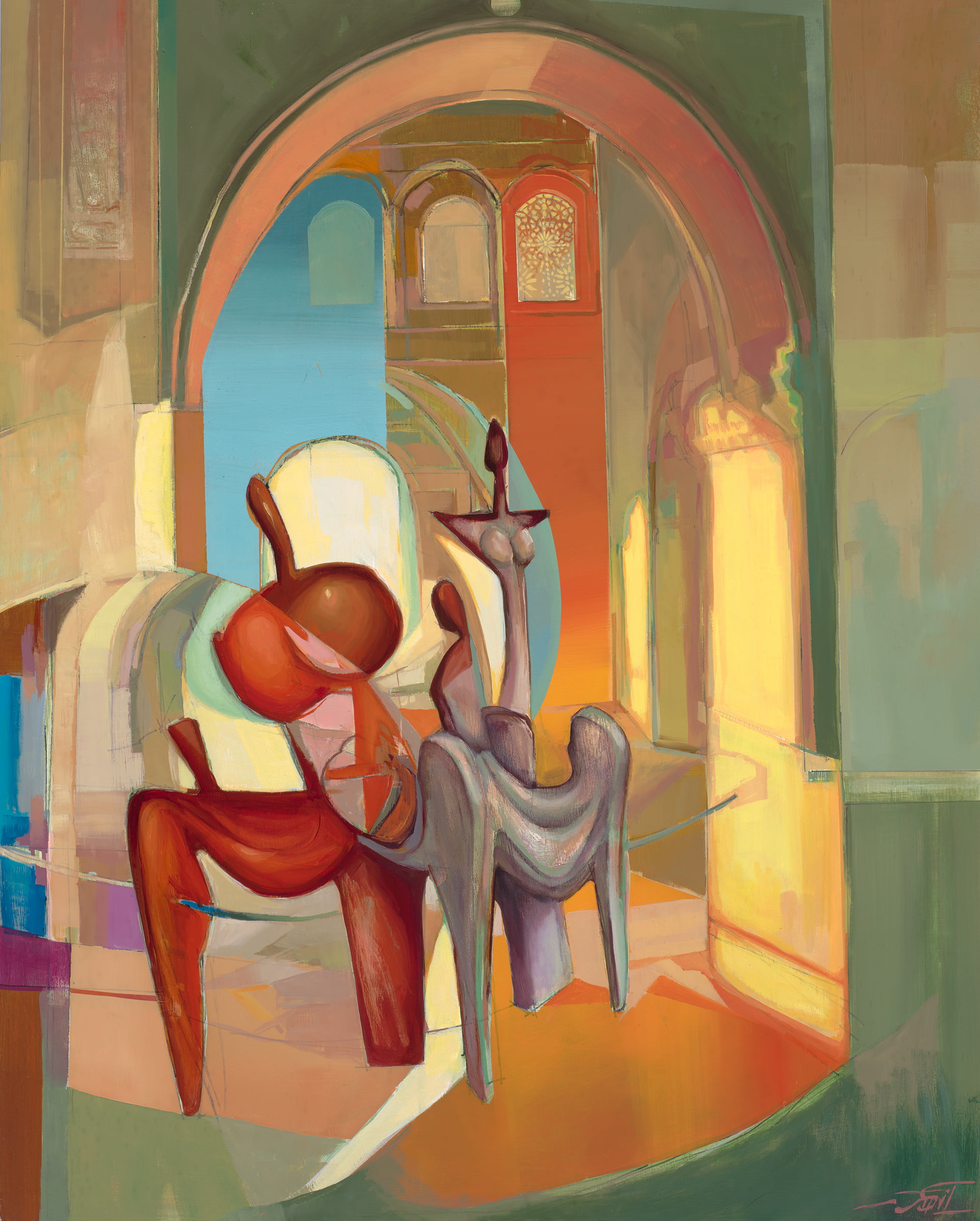
Anahita Akhavan’s Unsettled is organized into three sections, each one featuring very different kinds of images. Abstract Exploration is a series of abstract interpretations of landscapes and architecture. Rather than seeking to represent their subjects realistically, these drawings use shape, line, colour and perspective to draw the gaze through the scenes, creating a sense of movement and exploration. However, they are still somewhat representational—they portray some things that are specific and recognizable. This contrasts with the abstraction of several of the works in the Collages series, which are focused more on structure, process and pattern than on representation. Most of these works use simple geometric forms as motifs, which are then varied, repeated and combined in complex ways. Finally, the Garden of Forms series serves as a kind of synthesis of the approaches in the other two sections; remixing and abstracting elements of landscapes and architectural forms to create spaces that reflect themes of nature and paradise in Islamic art and architecture, as well as the symbolic language of Islamic carpet-weaving.
Because the works in each section are so different, describing them required distinct approaches. I initially tried to describe the Abstract Explorations as I would other landscapes—describing the scene overall, important features within it, and formal elements like space and texture. But I quickly realized this approach wouldn’t work because it didn’t allow me to describe the non-representational parts of these artworks in a way that integrated them with the rest of the image. How do you describe what a trapezoid that juts outward and upward from the side of a building is doing? I quickly realized that movement is very important within these images; forms that are not obviously representational often function to draw the eye through the scene, and recognizable forms are often distorted to accomplish the same thing. This movement creates the sense of exploration referenced in the name of the series. And so I tried to let my eye move through the works, and jotted down notes about what I noticed, in the order I noticed it—not just recognizable forms but impressions of temperature, texture and mood. I also made note of how my eye was moving through the image. Was it zig-zagging toward a clear destination? Was it moving smoothly and then suddenly interrupted? During our conversation, Anahita had noted that she is influenced by Islamic architecture, which seeks to create a feeling of wholeness by using structural elements that guide occupants’ attention toward a central point. These works are doing something similar, by restructuring scenes in order to guide the audience on a particular journey.
The Collages series was somewhat complicated to describe, because it contains works that are related by their role within the artist’s process, and not necessarily by their form or content. At the same time, this made for an interesting challenge because process, memory, and the merging of interior and exterior are such important themes across Anahita’s work. The question became how to describe these works in a way that acknowledged their qualities as artistic images in their own right, but also their materiality, which is significant to their role as documentation of an artistic process, and their relationship to some of the completed works in the Garden of Forms series.
Most of the Collages are made from painted, cut and collaged mylar paper. This material is slightly translucent, which gives the works a delicate, ethereal feel. While all of these collages rely on the rearrangement and layering of simple geometric motifs in order to create complex, holistic images, some of them have a more explicitly pattern-like structure, where motifs are arranged into distinct segments that are then repeated and varied. For these pieces, I tried to emphasize the structural, rhythmic nature of the images, by describing the segments in broad, simple terms, and then focusing on how they were configured.
The Collages series also contains two digital photographic collages, which combine much more obviously representational elements to create surreal but recognizable architectural spaces. I took a more prosaic approach to describing these images, which enabled me to describe the collage elements, their (digital) material qualities and their apparent symbolism in a more direct and hopefully comprehensible way. I used the same prose-based approach with the works in the Garden of Forms series, for the same reasons. A number of the Garden of Forms pieces reference or refine images from the other two sections. For those works, I tried to echo the language that I had used to describe their earlier iterations. I also used these descriptions to supplement each other, allowing me to focus on different elements of each related image and avoid the problem of “over-describing.”
Conclusion:
Some General Principles for Artistic Image Description
If possible, communicate with the artist: It is helpful to understand how an artist was hoping for audiences to experience their work. Knowing what elements they want to feature, versus elements they wish to leave up to interpretation will help determine how to approach the artistic description. Learning about the artist’s influences, materials and methods, as well as about any themes, motifs and messages, and culturally specific details within the works they had chosen to exhibit will strengthen the description.
Analyze visual language: Visual language may not carry as much meaning for someone who doesn’t engage with the world visually, so it is worth taking the time to analyze what other sensory experiences visual language can be associated with. For example, rather than describing a “clear blue sky,” consider what it feels like to be outside on a day when the sky is that colour, and you may come up with something like, “the loud glare of a cloudless sky.”
Be mindful of imposing artistic inspirations on the work: Visual analyses often draw connections to other artworks/movements, yet, as is the case with metaphors, those connections may lack relevance for nonvisual audiences. Also, organizations that currently seek artistic descriptions tend to be situated more deeply in community spaces, featuring more marginalized artists, and so writers need to be mindful when relating their works to the forms of art that have dominated these fields for so long. For these reasons, someone who is describing an image might find it useful to draw out what these connections visually represent and use that as a starting point.
Allow artistic descriptions to inform the curation process: A successful description is the result of time analyzing an image, which can reveal things a curator might miss. A curator may be interested to know the words and themes that are repeated within an image and across a series of images, as well as what gets edited out. An open dialogue between the practitioner and the curator has the potential to impact the layout of an exhibit, the works that are featured, and even the broader narrative it constructs.
Balance multiple acts of care: Care for the artist is a mode of care for the practice, and care for the practice is a mode of care for the nonvisual audience. The embrace of artistic descriptions as a creative outlet will boost institutional perceptions of their relevance, especially amongst venues that have historically failed to provide accommodations. But practitioners need to heed caution to prevent turning artistic descriptions into a spectacle. The description serves to accompany a work, not to overpower or undermine an artist (unless the artist is intentionally causing harm through the work, and in that case, have at it). There’s also a risk of artistic descriptions becoming so widely embraced that the function they serve, creating an equitable art experience, gets lost. The balance of care for the artist, the practice, and the nonvisual audience is the best way to sustain the availability of artistic descriptions in perpetuity.
Difficult things need descriptions too: When writing any image description, it is important to remember that anything that doesn’t get described gets erased. There are countless reasons why a person may avoid describing something, ranging from a fear of causing harm when lacking a cultural frame of reference, to discomfort around taking a side with a politically fraught symbol, to the pain of relaying the horrors of a heartbreaking image. If the avoidance is due to trauma, then seek out the curator to take on those images. The curator and the artist need to be trusted as experts. If they neither seem to hold this knowledge, that should raise questions about the curation process. Once an initial description is written, check it to make sure elements of a visual analysis (Line, Shape, Tone, Color, Pattern, Texture, and Form) have been included, giving the reader a chance to fill in the blanks.
Artistic Descriptions take time: An effective artistic description doesn’t just happen, and practitioners will quickly learn that any one artistic description cannot be considered complete until the last image in the show has been described. Context can cause elements that don’t initially stick out to increase in acuity. Conversely, things that initially seemed obvious may decrease in importance as more descriptions are written. The amount of time this process takes should not be underestimated. Everyone’s writing process is different, but we have learned, for ourselves, to budget an initial 1.5 hours for each show to analyze, plan, and structure the descriptions. We then allot 20 minutes per image to ensure we are properly compensated for our time and commitment.
A special thanks to the following people, partners, and funders:
Digital Designer: Alex Thalheim-Martin
Accessibility Consultants: The Disabled List
About Us
North York Arts (NYA) collaborates with artists, arts organizations, and partners to develop, strengthen, and promote cultural programming and initiatives for North York communities
Contact us
North York Arts
5040 Yonge St.
Toronto, ON, M2N 6R8
Monday – Friday, 9am – 5pm
